News by the ton: 75 years of US advertising
There are two ways you can talk about newspapers. You can talk about the ‘fourth estate’, and newspapers’ role in culture, politics, governance, the exchange of ideas and civil society. But you can also talk about newspapers as a specialised light manufacturing industry, that aggregated attention to sell advertising. There’s a common line about Google and Facebook that ‘if you’re not paying, you’re the product’, but this is pretty much what newspapers did: if you read old accounts for, say, the New York Times Company, you can see that they were giving the product away at close to cost and making the money from selling your attention.
(‘Wages’ in this chart includes both editorial staff and production & delivery staff - the New York Times was delivering 45% of its circulation, and the Boston Globe 70%, and charging a premium for this.)
I picked 1994 because that’s the year Netscape launched and kicked off the consumer internet, and as we all know, that has been somewhat material for newspapers’ print ad business.
I wrote recently about the way the numbers in this chart didn’t really change until the financial crisis in 2008, almost 15 years after the consumer internet began, but it’s also worth looking at how those numbers have changed over a longer period.
There are two interesting stories here - the collapse in the last two decades, but also the earlier growth.
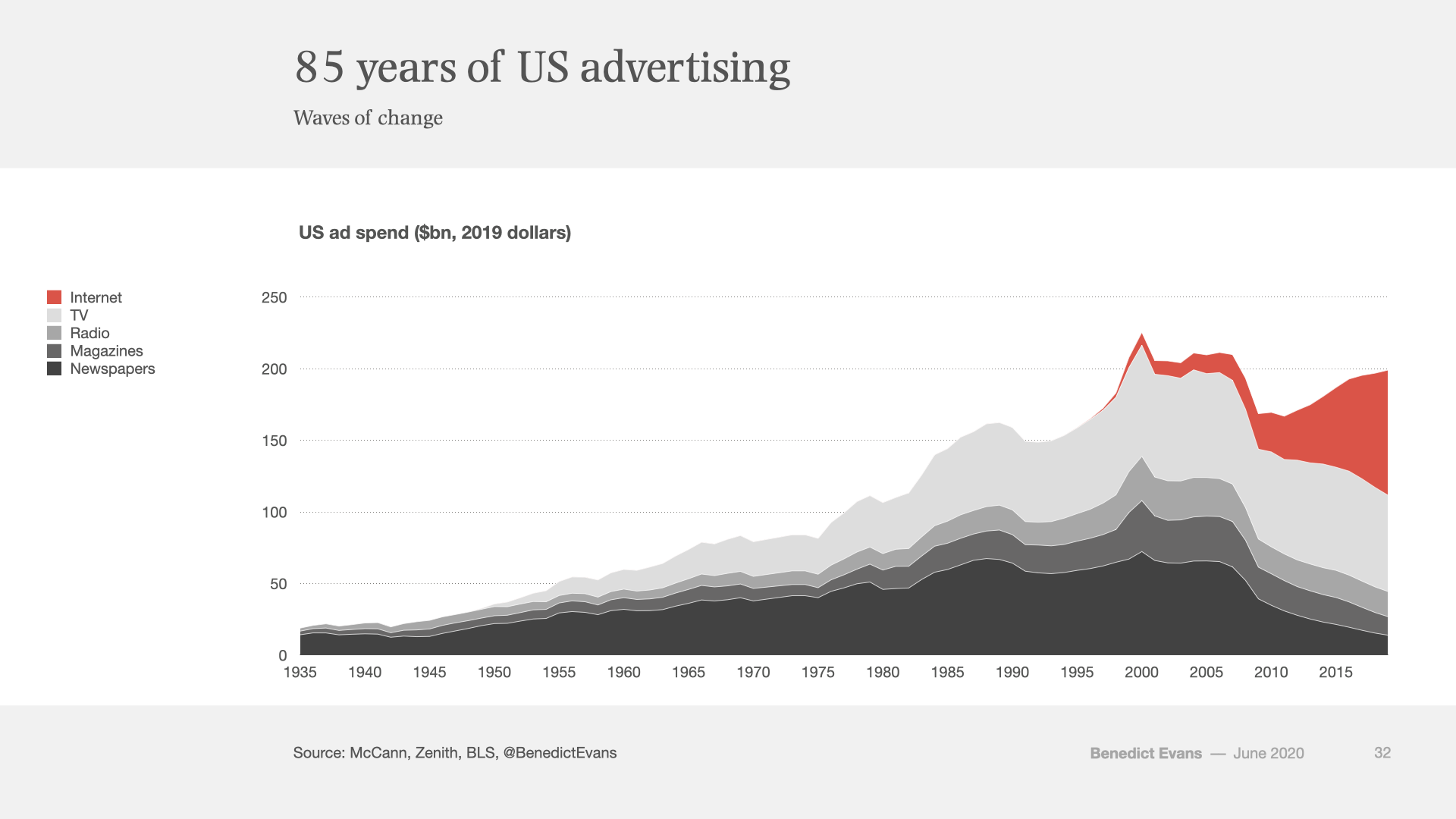
First, the collapse. Let’s add the internet to the chart, and let’s show all the rest of mass media advertising as well.
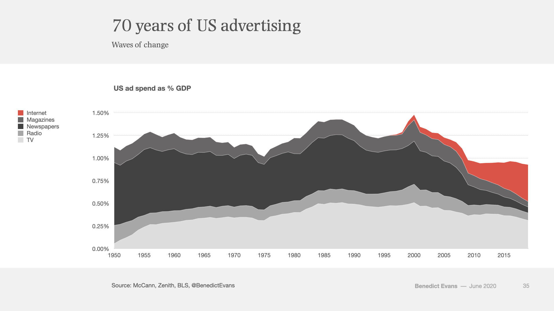
The problem with this chart is that long-term inflation calculations get increasingly meaningless the further back you take them, and since historically advertising has been closely indexed to the overall economy, the growth in the first part of this chart is telling us much more about the growth of the US economy than it is about advertising. So, let’s take it as a share of GDP. At this point I’ll start the time series at 1950, because WW2 adds a big distraction, and let’s try changing the series order.
There are lots of things going on here, but I would start with the top line: advertising share of GDP started sliding immediately after the Dotcom bubble, had a major step down in the financial crisis and has been suspiciously flat ever since. That decline was very obviously concentrated in print but actually affected TV and radio as well. We think of TV advertising as being pretty much unaffected by the internet so far, but on this data it’s down by 40% as a share of GDP. The economy grew and advertising didn’t get its historic share of that growth.
It’s very common for people - especially newspaper people - to look at the newspaper and internet series in these charts and conclude that all the money went from newspapers to internet. There’s also a tendency to try to calculate Google and Facebook’s share of that ‘internet’ line. This can get you onto shaky ground quite quickly. As that change in share of GDP (and my phase ‘suspiciously flat’) should suggest, what’s actually happened is that the market has been both reallocated and repriced, a lot of money left the data that’s being captured here, and a lot of other money came in.
So: if you talk to people at both Google and Facebook and in the agency world, you’ll hear that a lot of the money spent on Google and Facebook is money that was never spent on traditional advertising - it’s coming from SMEs and local businesses that might have spent in classified at most but probably wouldn’t have done even that. $60bn of consumer spending went through Shopify last year - it’s safe to assume those vendors spent money on advertising, but how many of them would have bought an ad in a local newspaper? This has also come at much lower prices: Facebook in particular has been massively deflationary to online advertising: it offers vast quantities of relevant advertising inventory at much lower prices and much lower entry costs than you’d have needed in print, let alone TV.
Meanwhile, ‘advertising’ is only a subset of all the money being spent to ‘get people to buy things’, and the data captured in traditional metrics is only another subset, and money moves between those categories. This graphic made a couple of years ago (by an old colleague - Hi Omar!) captures some of that complexity. Some parts of this are called ‘advertising’ and others ‘marketing’, but that’s not always the best way to look at them.
If an estate agent shifts their budget from an insert in a local newspaper to their own website and to fees for Zillow or Rightmove, where does that appear in charts of ad spend? What if they close a branch and put the rent budget into Rightmove? Booking.com and Expedia between them spent $10bn on Google ads last year: did that money ‘come from’ newspaper advertising? Or from retail rents paid by travel agents? Wix.com now has $740m of ARR: that’s mostly doing the job of advertising and marketing, so did that money come from newspapers and magazines? Or from rent? Is that even a useful question? (And meanwhile Wix is often a top-ten advertiser itself in Europe.) I pay Squarespace and Mailchimp a fee for this site and for my weekly newsletter: 20 years ago I might have bought a listing in a professional directory, but is that really comparable? If Procter & Gamble pays a supermarket for placement in the store, that’s categorised as ‘marketing’, but if it pays Amazon for placement in search results that’s categorised as ‘advertising’, and Amazon sold over $10bn of that placement last year. So, what does a chart of ‘internet advertising’ really capture, and what is it missing, and what share, exactly, do Google and Facebook have? Are you sure?
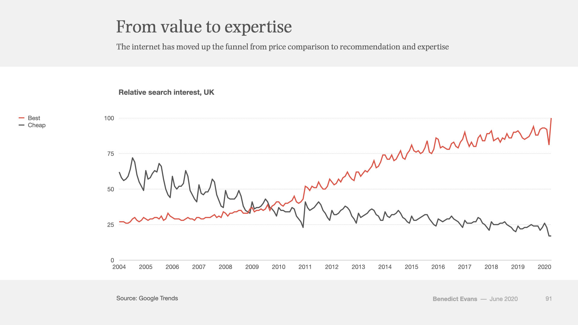
One of the most interesting charts I’ve seen on this theme comes from Google Trends. Like all Google Trends data it needs to be taken with a large pinch of salt, but this one is pretty instructive. I’d suggest this shows the internet moving up the ‘funnel’ - it moves from utility price comparison to recommendation and authority. That might be a rather more profound conflict with traditional forms of media that those raw ad sales.
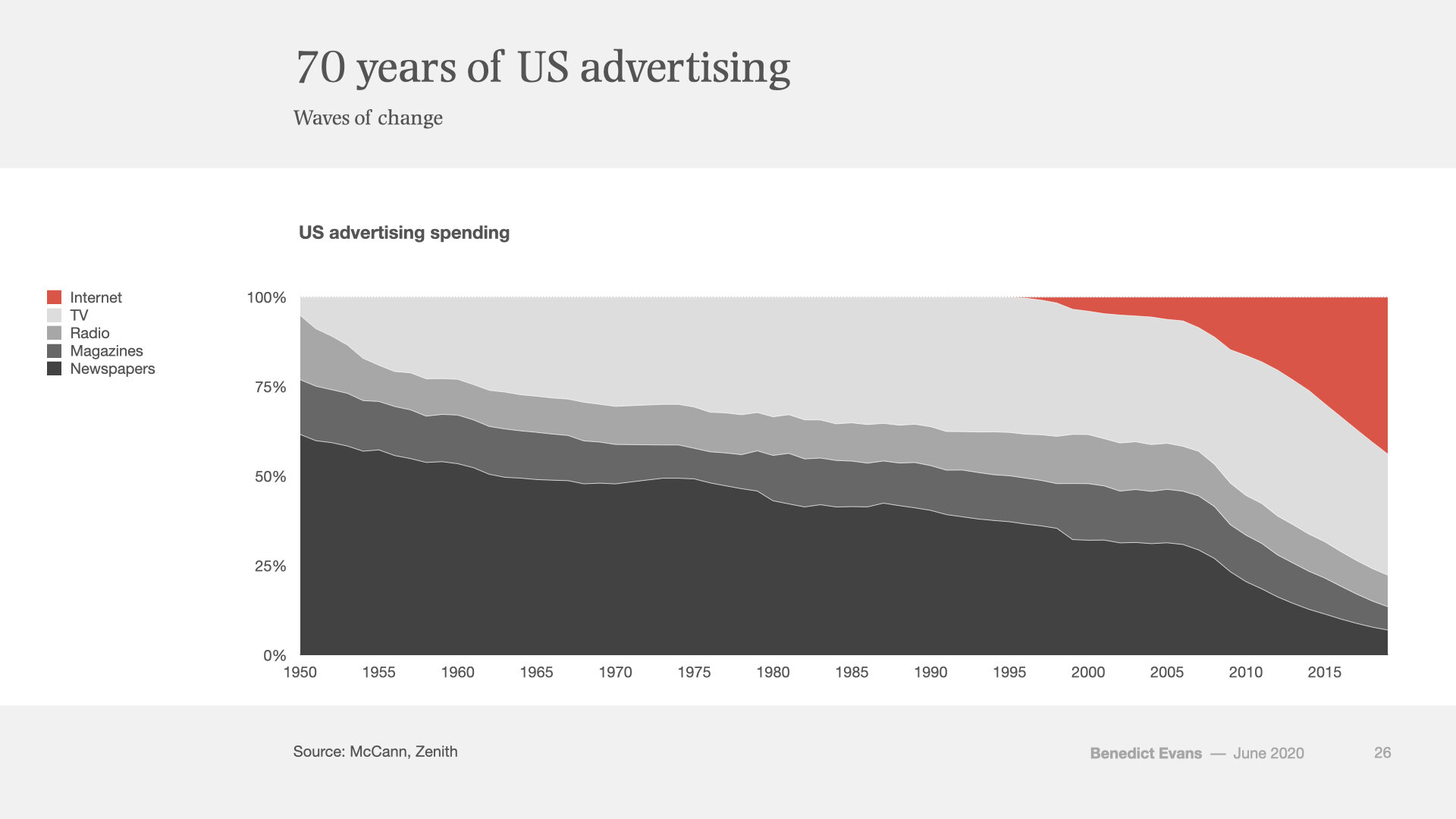
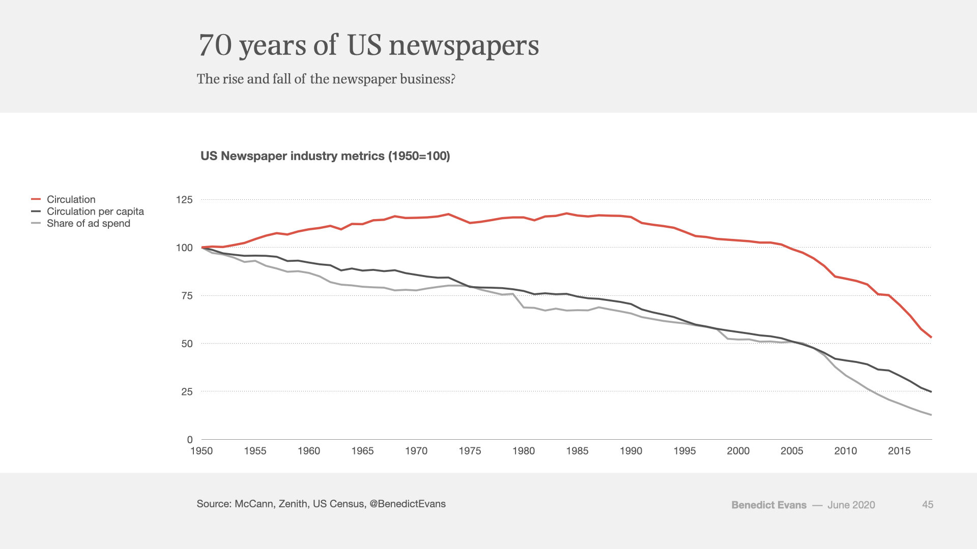
Finally, so far I’ve focused on the impact of the internet on revenue, but it’s worth digging a little into the some more second-order metrics for newspapers. As shown implicitly in some of the previous charts, but worth making explicit here, newspaper ad revenue may only have collapsed since 2008, but newspapers have been losing share of ad spend since the 1950s.
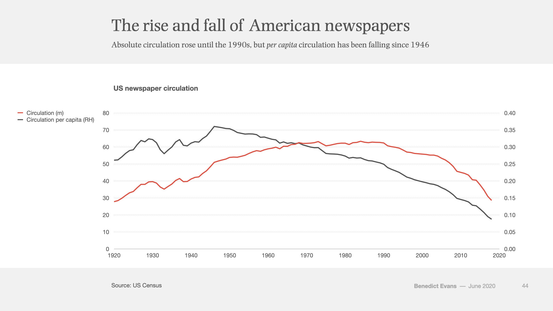
That’s not all they were losing. Absolute circulation rose until 1990, and has been falling since (‘gradually, then suddenly’), but circulation per capita has been falling since 1950, in common with most other developed markets.
Indexing these to 1950 makes the trend clearer.
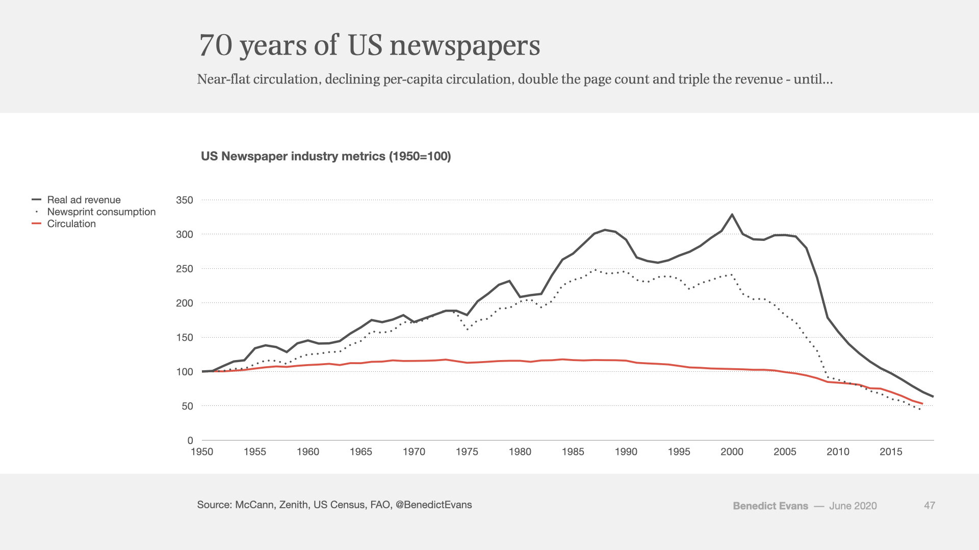
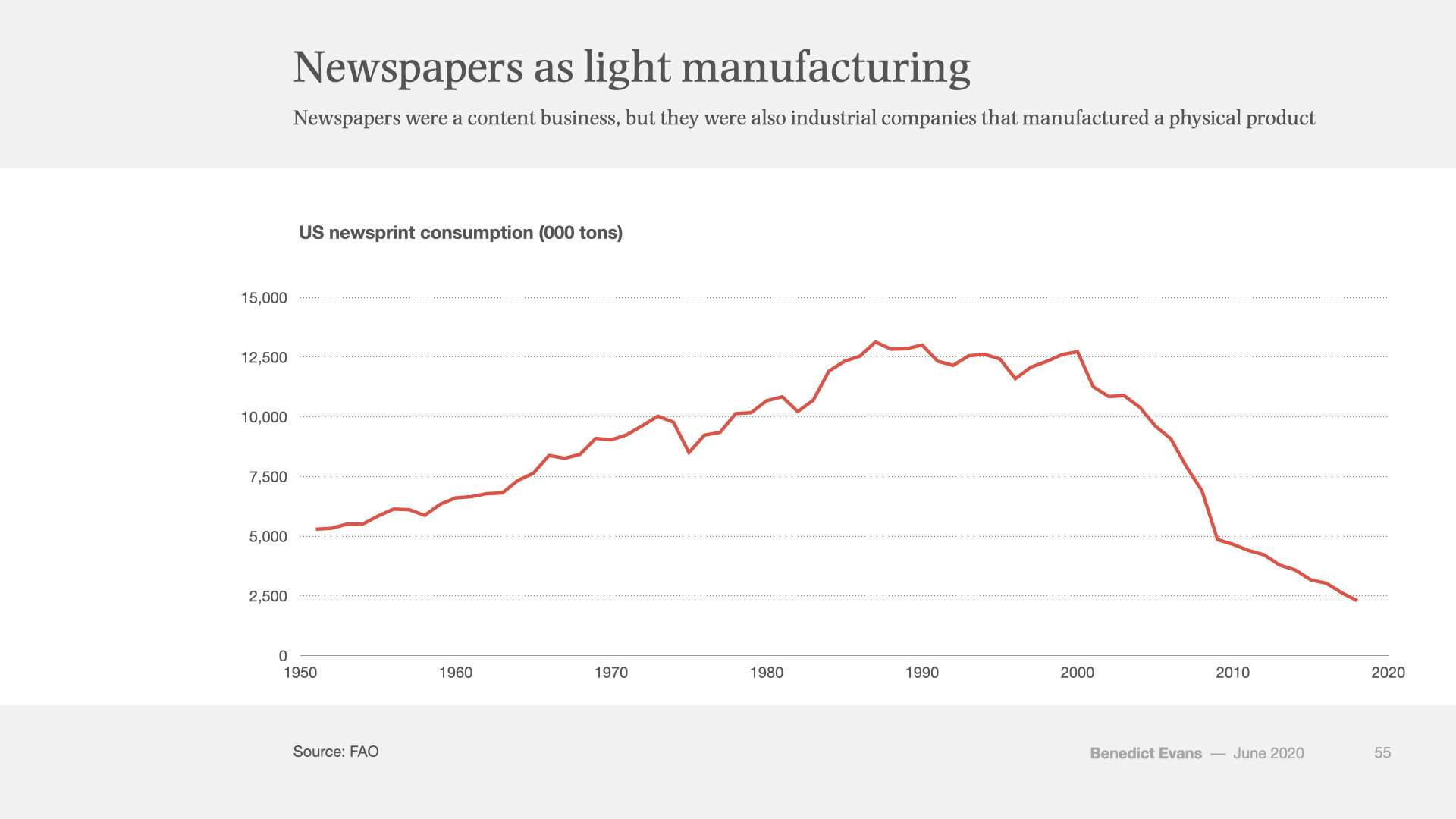
If we now add both revenue and newsprint consumption to this chart, we can see that newspapers combined stagnant-to-falling circulation with a rising page count and hence rising ad inventory and ad revenue. Prices went up as well, but (on this data) the increase in inventory was the key change.
In other words, if your users are flat, increasing the ad load can lead to higher revenue (this will sound familiar to many social network users). Of course, more ad pages needed more content pages to pad them out (the ratio was typically 65:35), and that meant more people to fill them. (This chart also suggests what one often hears anecdotally: that over time newspapers expected each person to produce more and more column inches.)
This is, of course, the cynical way to look at the numbers. You could equally well say that newspapers’ audiences shrank and moved upmarket, leading them to print more coverage, aimed at a different reader, and that that in turn supported more and higher value advertising. The result is the same either way: more journalists, more pages, more ads, and fewer readers, first per capita and then absolutely.
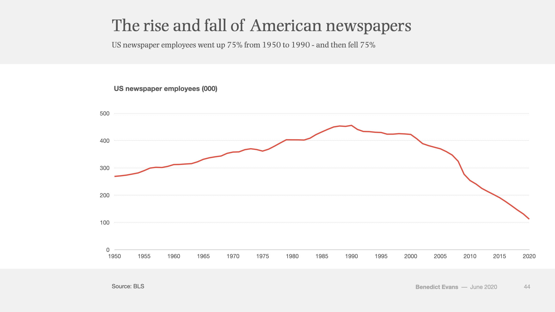
Conversely, rapidly declining circulation, fewer pages per newspaper and less overall revenue has meant fewer journalists. Indeed, there are now far fewer people working for American newspaper publishers than at any point since WW2, and probably rather longer.
None of these charts, of course, show newspaper companies’ internet advertising revenue, let alone the subscription businesses that some of them have managed to build. That’s partly because the employment numbers above speak pretty clearly about how well that’s gone for most of them (and I haven’t talked at all about the polarisation of success between large and small brands). But it’s also because newspapers were an oligopoly, and they lose that oligopoly online. Newspapers are, yes, a content business, but they were also a light manufacturing business, and it was the replacement of light manufacturing and trucking with bits that removed the barrier to entry and unbundled their attention. So, here’s what that business looks like. In 2018, the US newspaper industry shipped ~2.5m tons of newspaper, down from 12.5m tons at its peak.


